Bello Magazine
Case Study
MAGSTATS Issue: Premiere Issue 2005, V1
Frequency: Quarterly
Launched: 2004
Circ: 351,000
Publisher: Multicultural Media, LLC
Art Director: D.Zapa
Editor-in-Chief: Fernando Diaz

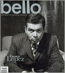
The cover of the premiere issue of bello Magazine, with its metallic palette nameplate and cover subject Alejandro Fernandez donning the Mexican iconographic charro suit emulating the look of one of Mexico’s revolutionary heroes of the people, Emiliano Zapata. This cover connects classic historical iconography with one of Mexico’s modern celebrity, Alejandro Fernandez, creating a vibrant and classic look. bello’s art director, D.Zapa, says editor-in-chief and creative director Fernando Diaz found inspiration from a decidedly vintage source: the history and struggles of Mexican-Americans that is tied to the history of Mexico. He believes you cannot dissect the US subculture known as Latino/Mexican-American/Chicano, without understanding the cultures beyond the US border. That, along with his desire to visually redefine the intensity, quality, and artistic brilliance of Latino publications in the US defined the essence of bello.” In line with the magazine’s typical style, the cover is not as much about cover line typography, as it is about arresting classical image merging with and defined by the name and modern logo choice. The lowercase bello, the magazine’s namesake and logo, subtly incorporates the indigenous cultures of the Americas. D.Zapa said, “We wanted to create a logo that defined the present voices of the world’s Chicanos and Latinos and the brilliance, beauty and power of our indigenous past, so the lowercase ‘l’s are subtly created to reflect Mesoamerican pyramids.
The name ‘bello’, translated into English means ‘beautiful, bold’. The choice to use lowercase was to give the publication a sense that bello Magazine is a magazine for ‘every person’. The metallic fifth color used was to give the logo a modern vibe. The name, logo, and cover image fuse together to create a bold, artistic, cultural connection that represents an ever-growing subculture of our US population—the Chicano, Mexican, Latino. Cover lines, which D.Zapa expresses are extremely overused on almost all US mainstream publications, were kept almost non-existent. “Tag lines detract from the cover’s central image and we are in the business of visual stimulation. If we did our job at the highest possible level, the reader will be drawn in by the piece of art our team created. Also, readers can interpret the cover artwork from their own perspectives. This creates an interactive relationship between our team, the publication, and the reader. And that is our ultimate goal—for our readers to actively pursue the search for answers within the pages of bello Magazine. Ultimately, we are all the owners of original thoughts. This begins with the visual stimulation of the cover.” said Fernando Diaz. D.Zapa Media also conceptualized, produced, directed and chose the celebrities to be featured in national radio spots featured on Clear Channel. A 5-part campaign was created in order to drive up subscription numbers for bello Magazine as well as promote a nationwide bello event series.
In addition to first, second and third anniversary receptions in San Antonio, Texas, Beverly Hills, CA, and Las Vegas, Nevada, bello Magazine established a solid reputation with media placement in the following:
- NBC News
- ABC News
- KTLA 5 Morning News
- KTTV 11 Morning News
- Fox News
- Los Angeles Times
- KCOP 13 News
- Telemundo
- Univision
- Al Rojo Vivi Show (Univision)
- Texas Monthly
- NBC Nightly News
- CNBC
- La Opinión
- Despierta America
- Clear Channel national radio


